
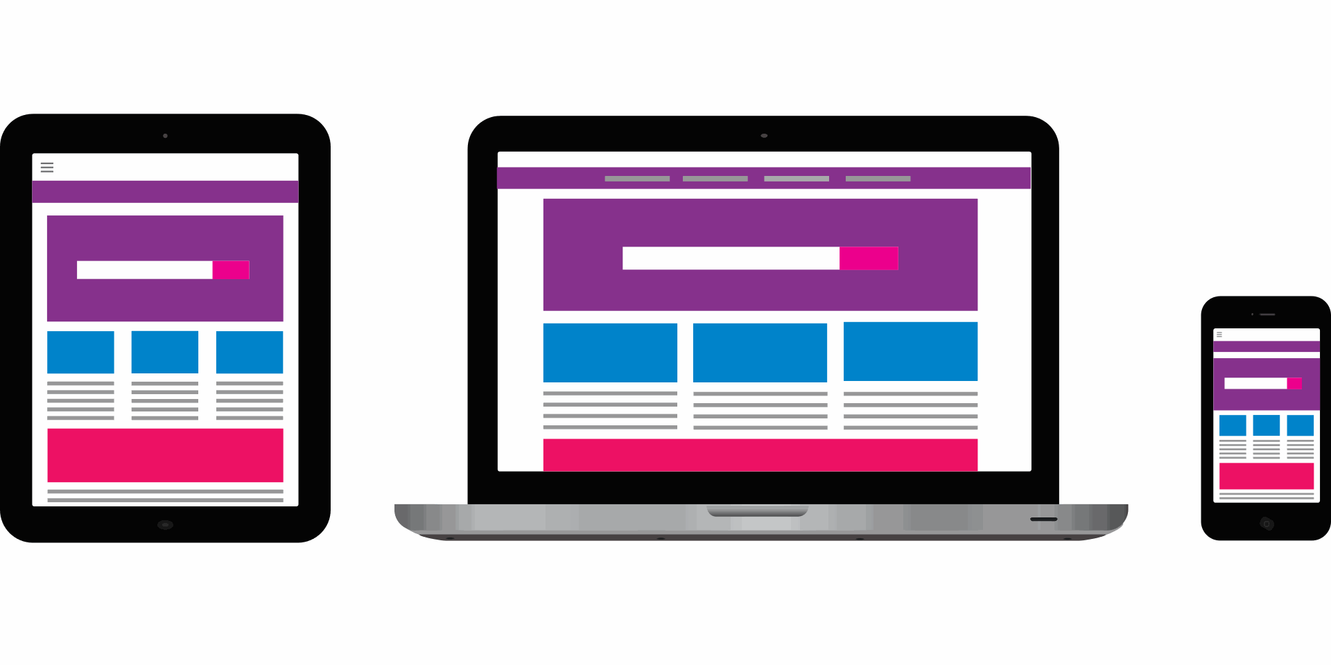
Google has indexed the mobile version of your site as the primary version for years now, not a secondary consideration — if your mobile experience is worse than desktop, that's the version search engines are actually judging you on.
1. Use a Responsive Design
- Flexible Layouts: Implement a responsive design that adjusts the layout of your website based on the screen size and orientation of the device.
- Media Queries: Use CSS media queries to apply different styles for different devices, ensuring your site looks good on all screen sizes.
- Fluid Grids: Design your layout using fluid grids that scale proportionally, rather than fixed-width layouts.
2. Optimize Page Load Speed
- Compress Images: Reduce the file size of images without compromising quality using tools like TinyPNG or ImageOptim.
- Minimize HTTP Requests: Limit the number of elements on your pages, such as scripts, images, and CSS files, to decrease load times.
- Enable Browser Caching: Allow browsers to store some data locally, so they don’t have to reload the entire page every time a user visits.
- Use a Content Delivery Network (CDN): Distribute your content across multiple servers worldwide to ensure faster delivery to users based on their geographic location.
3. Simplify Navigation
- Mobile-Friendly Menus: Use simple, easy-to-navigate menus that are accessible on small screens. Consider using a hamburger menu to save space.
- Clickable Elements: Ensure buttons and links are large enough to be easily tapped with a finger, and spaced adequately to avoid accidental clicks.
- Sticky Navigation: Implement sticky navigation bars that remain visible as users scroll, making it easier to navigate your site.
4. Optimize Content for Mobile
- Readable Text: Use a legible font size and line spacing to ensure text is easy to read on small screens. Avoid using small fonts or dense blocks of text.
- Short Paragraphs: Break content into short paragraphs and use bullet points to make it easier to scan.
- Responsive Images and Videos: Ensure images and videos scale properly on different screen sizes. Use responsive image techniques like srcset to serve the appropriate image size based on the device.
5. Enhance User Experience
- Touch-Friendly Design: Design your site with touch interactions in mind. Ensure all interactive elements are easy to use on touchscreens.
- Pop-Ups and Interstitials: Avoid intrusive pop-ups and interstitials that can frustrate mobile users. If necessary, ensure they are easy to close.
- Mobile Testing: Regularly test your website on various mobile devices and browsers to ensure it functions correctly and provides a good user experience.
6. Implement Accelerated Mobile Pages (AMP)
- Faster Loading: Use AMP to create lightweight versions of your web pages that load quickly on mobile devices.
- Improved SEO: AMP pages are favored by Google and can improve your search engine rankings and visibility in mobile search results.
By following these strategies, you can optimize your website for mobile, providing a better user experience and improving your search engine rankings.